Consistency in Data Flow and Context through “starred” feature
Honestly, as a designer, I don’t usually use Canva. But recently, out of curiosity, I downloaded the PC app to try it out. And to my surprise? I even thought it might become a “super app” that could surpass Figma in the future.
Simple Notes
The fact that Canva offers an extensive range of design templates for commercial use, allowing even non-designers to customize easily, is a huge advantage. In Korea, there’s a similar service called “Miri Canvas.”
- Currently, the primary target seems to be users who need fancy design results but aren’t designers themselves. However, I thought that if Canva added a design system creation feature, it could potentially expand its target to include designers as well.
- Canva’s integrations with other services also seem to contribute positively to its usability.
- What surprised me the most was the ability to create brand kits!
But, returning to the main point, what I want to discuss today is the “starred” feature, which allows users to mark favorite templates with a star icon.
This is a common feature in many services for helping users make selections by marking options.
Given the sheer volume of templates Canva offers, I think this is quite an essential feature. It allows users to save several favorite templates and make a final choice afterward. The flow looks something like this:
- Browse templates → Narrow down a few favorites → Go to a saved selection screen → Final selection → Start designing
So, I went through this flow.
Problems
1) I found a template I liked and clicked the star icon. A toast notification with “Starred” appears, and when I clicked “View,” it took me to a screen where my selected templates were archived.
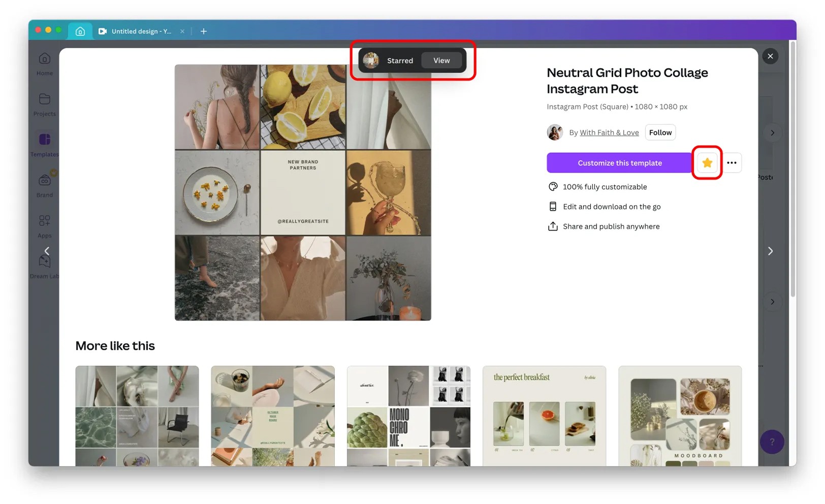
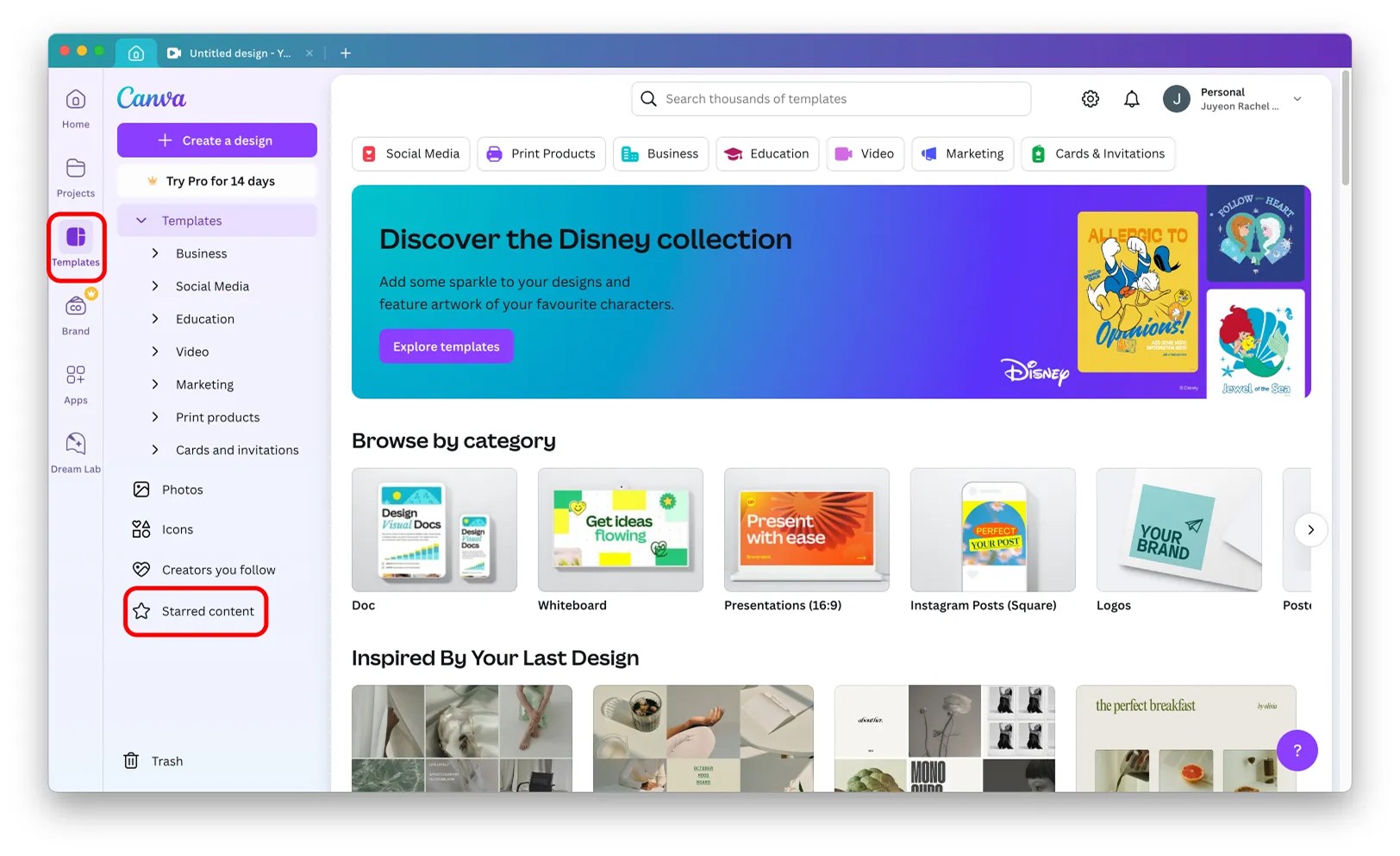
2) This screen is perceived as part of the “Projects” category in the left menu.
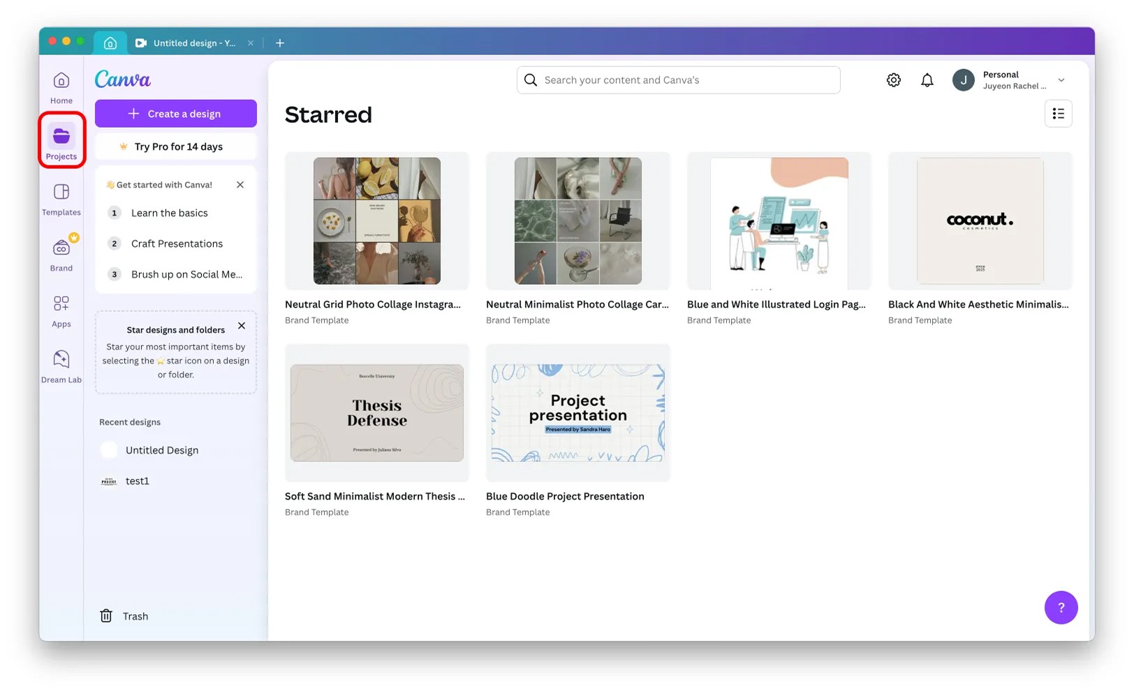
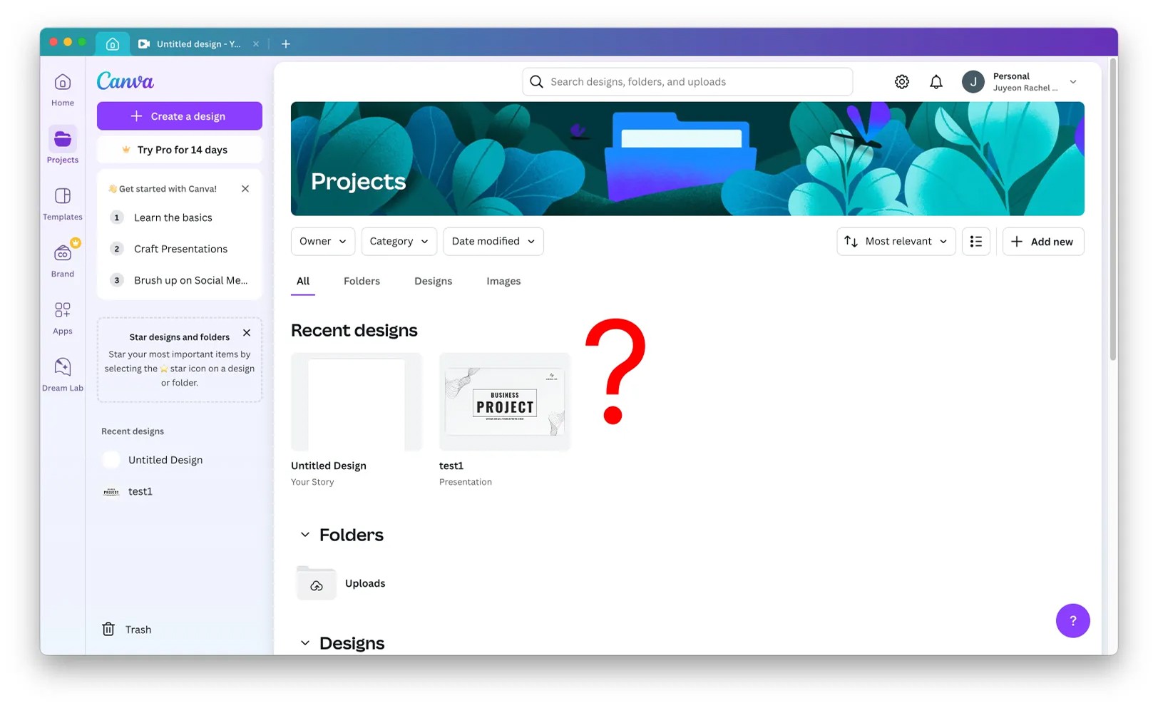
3) Later, when I navigated to a different category and wanted to return to the Starred Content screen, I went back to the Projects category, but it wasn’t there.
4) Eventually, I found the Starred Content screen under the Templates category, not Projects.
Opinions
- User-selected data should be displayed within a consistent context.
- When I clicked the star icon, Canva directed me to a screen (via toast message) that appeared to be under the Projects category, but it was actually in the Templates category. - Since all information flows through the top-level menu on the left, it would feel more natural if related screens were accessible within the same category. Currently, the parent-child relationships seem quite rigid, making it highly likely that users will have to navigate back to the main menu on the left to access related screens for different tasks.